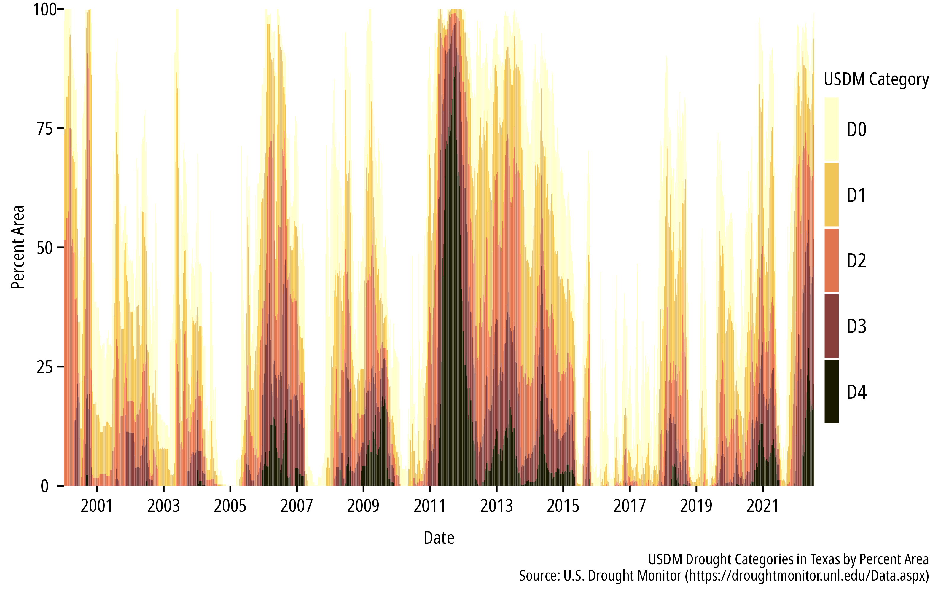
If you haven’t been paying attention, the summer of 2022 is turning into a pretty historic drought event. Here in Texas we are seeing comparisons to 2011 and potentially worse.
Austin-area reservoir levels compared to a long-term average, the previous two years, and 2011. Cool that the cool kids @twdb added 2011 to their Water Data for Texas webtool: https://t.co/Tj3JCOqfVv #txwater pic.twitter.com/SiGz1NO1QW
— Robert Mace (@MaceatMeadows) July 21, 2022
/2
— Shel Winkley (@KBTXShel) July 22, 2022
2011: Heat built early but was steady. By July 21st, there were some triple-digit days but the worst of those were waiting for August & September
2022: The extreme heat came quick & fast. While the cooler year as a whole May - July's temps have been unprecedented for #bcstx pic.twitter.com/Pk1T6D5l70
There are a lot of great datasets to explore for temperature, precipitation, and drought. Here are some R packages that I will use:
Precipitation
The prism 📦 provides streamlined access to the Oregon State University PRISM Climate Group data. This includes, modeled 30-year gridded normal precipitation, temperature and other data over the contiguous US. Data is available at 4 km and 800 m resolutions. The 30-year normals for April, May and June are shown below.
## download monthly normals
get_prism_normals(type = "ppt",
                  resolution = "4km",
                  mon = 1:6,
                  keepZip = FALSE)

## return the folders
ppt_norm_1 <- prism_archive_subset(type = "ppt",
                                   temp_period = "monthly normals",
                                   mon = 1:6,
                                   resolution = "4km")

## convert to terra
ppt_norm_1 <- pd_to_file(ppt_norm_1)
ppt_norm_1 <- rast(ppt_norm_1)


## change the layer names to something sensible
names(ppt_norm_1) <- month.name[1:6]

## plot
ggplot() +
  geom_spatraster(data = ppt_norm_1) +
  scale_fill_scico(name = "Precipitation (mm)", palette = "lapaz", direction = -1,
                   trans = "pseudo_log",
                   breaks = c(0,10,100,500),
                   na.value = "transparent") +
  coord_sf(crs = 2163) +
  facet_wrap(~lyr, ncol = 2, nrow = 3) +
  theme_mps_noto() +
  theme(panel.grid = element_blank(),
        panel.border = element_blank(),
        axis.text = element_blank(),
        axis.ticks = element_blank(),
        strip.text = element_text(hjust = 0, size = 10),
        strip.background = element_blank(),
        legend.position = "right",
        legend.direction = "vertical",
        legend.key.height = ggplot2::unit(40L, "pt")) +
  labs(caption = "1991-2020 (30-year) Monthly Normal Precipitation\nSource: PRISM Climate Group (https://www.prism.oregonstate.edu/)")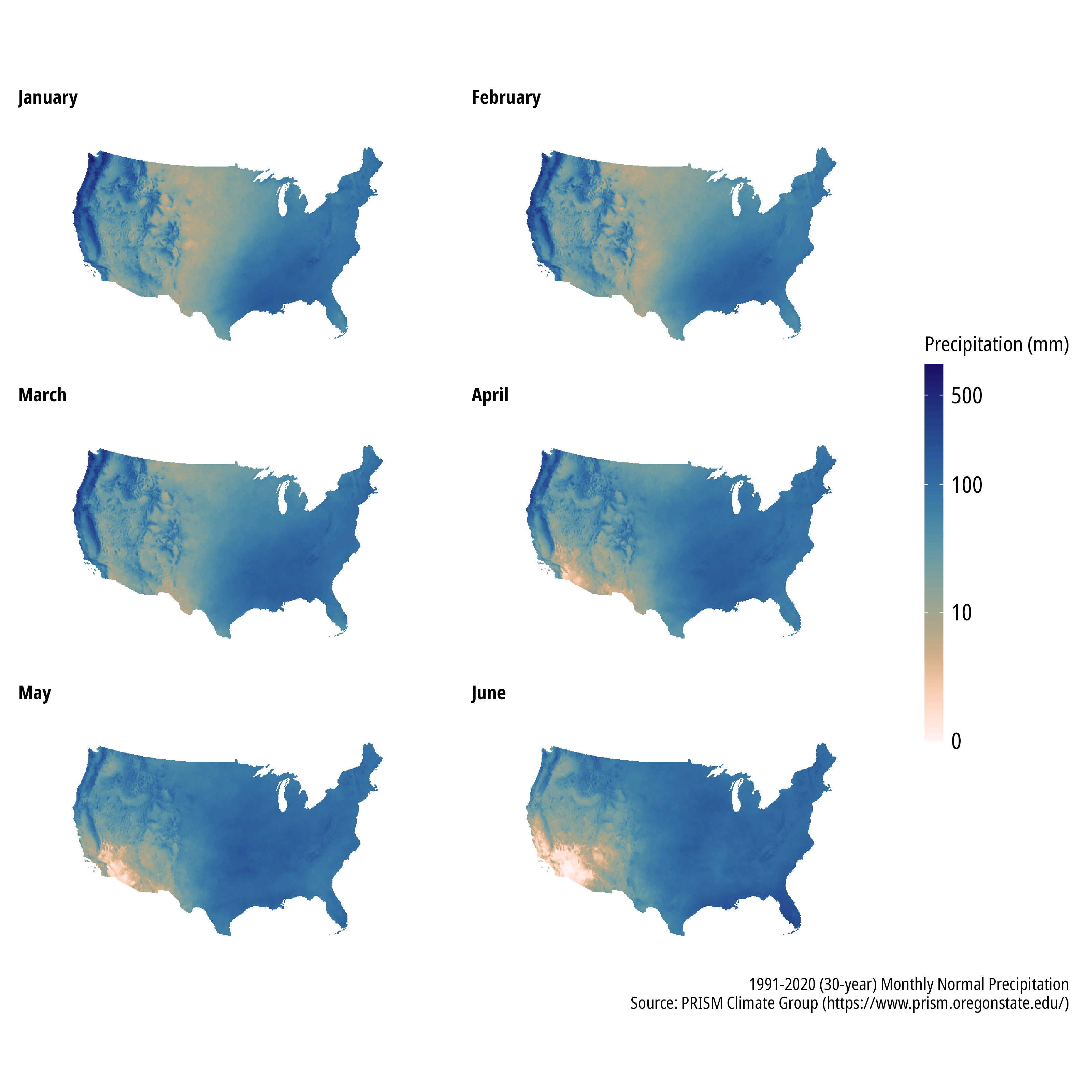
We can also obtain gridded total monthly precipitation for each month of 2022 (so far) and calculate the precipitation anomaly for each month. The function to download monthly precipitation is shown, the code to plot monthly data is the same as above and isn’t shown. It is immediately evident the January through May 2022 look very rough for the southwest US compared to the average monthly precipitation totals.
## download monthly data
get_prism_monthlys(type = "ppt",
                   year = 2022,
                   mon = 1:6,
                   keepZip = FALSE)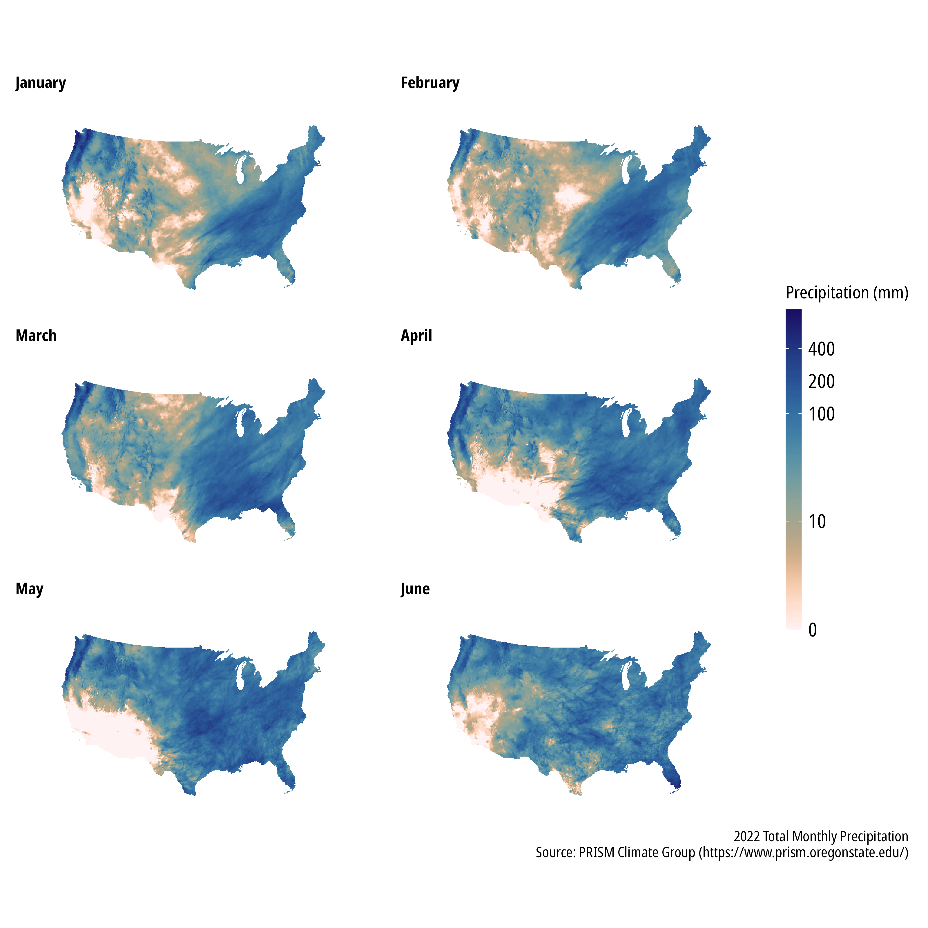
The precipitation anomaly for a given month can be quickly calculated and plotted. We can use the terra 📦 to calculate the percentage difference from the 30-year monthly mean precipitation.
anomaly <- ((ppt_1 - ppt_norm_1)/ppt_norm_1)*100

ggplot() +
  geom_spatraster(data = anomaly) +
  scale_fill_scico(name = "Precipitation Anomaly\n(% difference)",
                   palette = "vik",
                   direction = -1,
                   breaks = c(-100,0,100,200,300,400),
                   limits = c(-100,400),
                   ## some infinite and very high values, will squish them to 400
                   oob = scales::oob_squish_any,
                   ## this centers us on zero
                   values = scales::rescale(c(-100,0,400)),
                   na.value = "transparent") +
  coord_sf(crs = 2163) +
  facet_wrap(~lyr, ncol = 2, nrow = 3) +
  theme_mps_noto() +
  theme(panel.grid = element_blank(),
        panel.border = element_blank(),
        axis.text = element_blank(),
        axis.ticks = element_blank(),
        strip.text = element_text(hjust = 0, size = 10),
        strip.background = element_blank(),
        legend.position = "right",
        legend.direction = "vertical",
        legend.key.height = ggplot2::unit(40L, "pt")) +
  labs(caption = "2022 Monthly Precipitation Anomalies\nSource: PRISM Climate Group (https://www.prism.oregonstate.edu/)")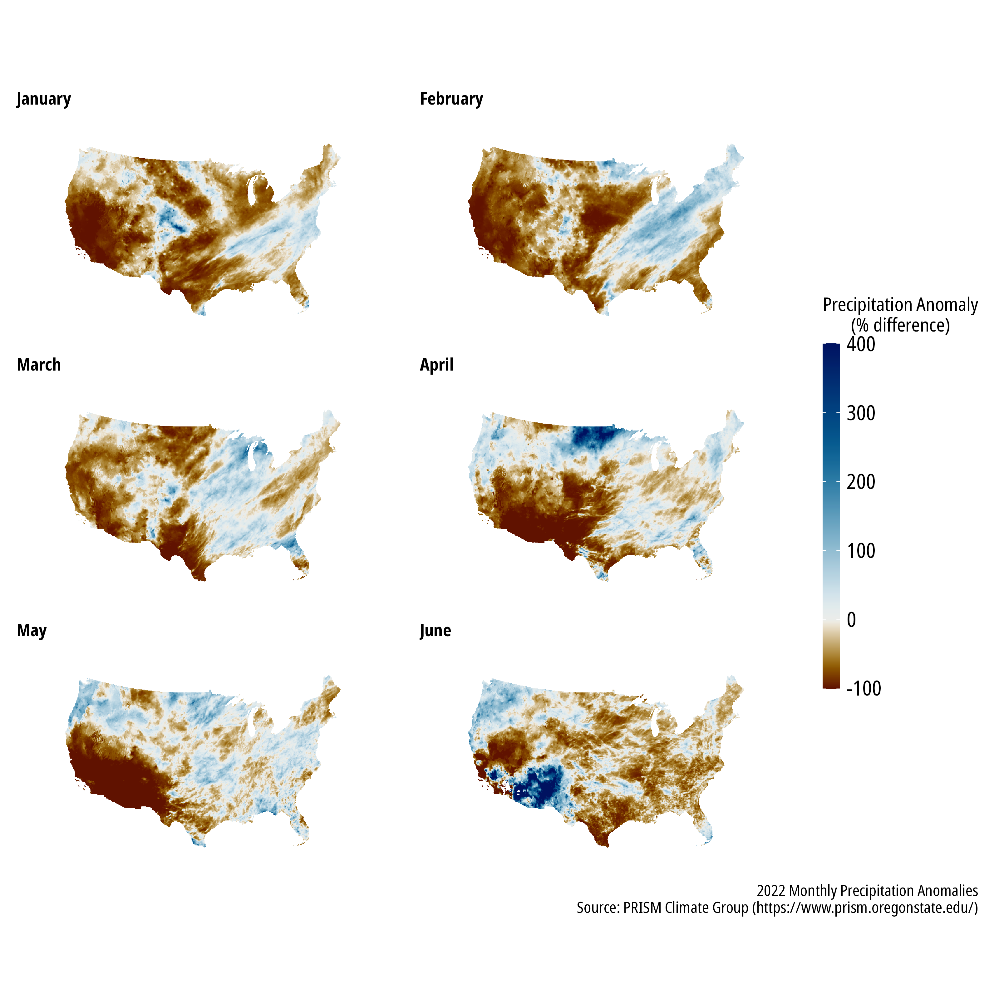
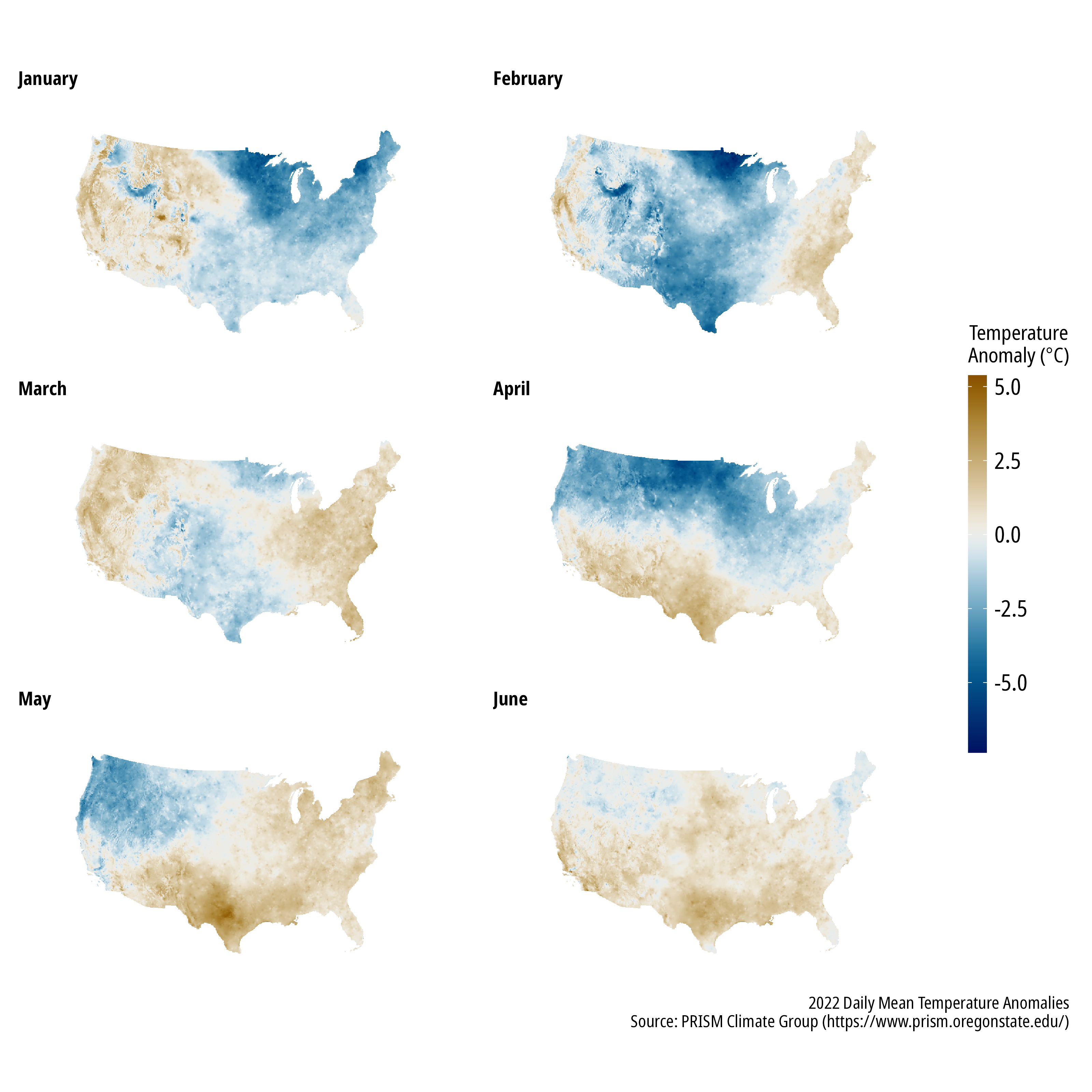
Temperature
PRISM also provides minimum, maximum, and mean daily temperature data. Anomalies for the year are shown below.
Drought
The US Drought Monitor provides weekly maps that categorize the locations and intensity of drought across the US. The National Drought Monitoring Center provides some REST services to programatically download data. This example will download and plot area statistics for drought categories across Texas.
## download data using the REST API. More info here:
## https://droughtmonitor.unl.edu/DmData/DataDownload/WebServiceInfo.aspx

url <- "https://usdmdataservices.unl.edu/api/StateStatistics/GetDroughtSeverityStatisticsByAreaPercent?aoi=48&startdate=1/1/2000&enddate=7/15/2022&statisticsType=1"
r <- GET(url, accept("text/csv"))
df <- content(r)
df |>
## the values need to be adjusted because category D0
## represents D0-D4, D1 is D1-D4, etc.
mutate(D0 = D0-D1,
D1 = D1-D2,
D2 = D2-D3,
D3 = D3-D4) |>
pivot_longer(cols = c("D0", "D1", "D2", "D3", "D4"),
names_to = "Drought_Category") |>
mutate(Drought_Category = as_factor(Drought_Category)) |>
mutate(Drought_Cateogry = fct_relevel(Drought_Category, "D0", "D1", "D2", "D3", "D4")) |>
ggplot() +
geom_col(aes(ValidStart, value, fill = Drought_Category)) +
scale_fill_scico_d(palette = "lajolla", name = "USDM Category") +
scale_y_continuous(expand = c(0,0)) +
scale_x_date(date_breaks = "2 years",
date_labels = "%Y",
expand = c(0,0)) +
theme_mps_noto() +
theme(panel.grid = element_blank(),
panel.border = element_blank(),
strip.text = element_text(hjust = 0, size = 10),
strip.background = element_blank(),
legend.position = "right",
legend.direction = "vertical",
legend.key.height = ggplot2::unit(40L, "pt")) +
labs(caption = "USDM Drought Categories in Texas by Percent Area\nSource: U.S. Drought Monitor (https://droughtmonitor.unl.edu/Data.aspx)",
x = "Date", y = "Percent Area")